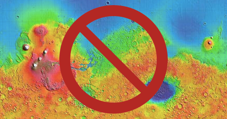
The choice of color to represent information in scientific images is a fundamental part of communicating findings. However, a number of color palettes that are widely used to display critical scientific results are not only dangerously misleading, but also unreadable to a proportion of the population. For decades, scientists have been pushing for a lasting change to remove such palettes from public consumption, but the battle over universal accessibility in science communication rages on. A color map is a palette of multiple different colors that assign values to regions on a plot. An example of a misleading color map is…
This story continues at The Next Web


No comments:
Post a Comment